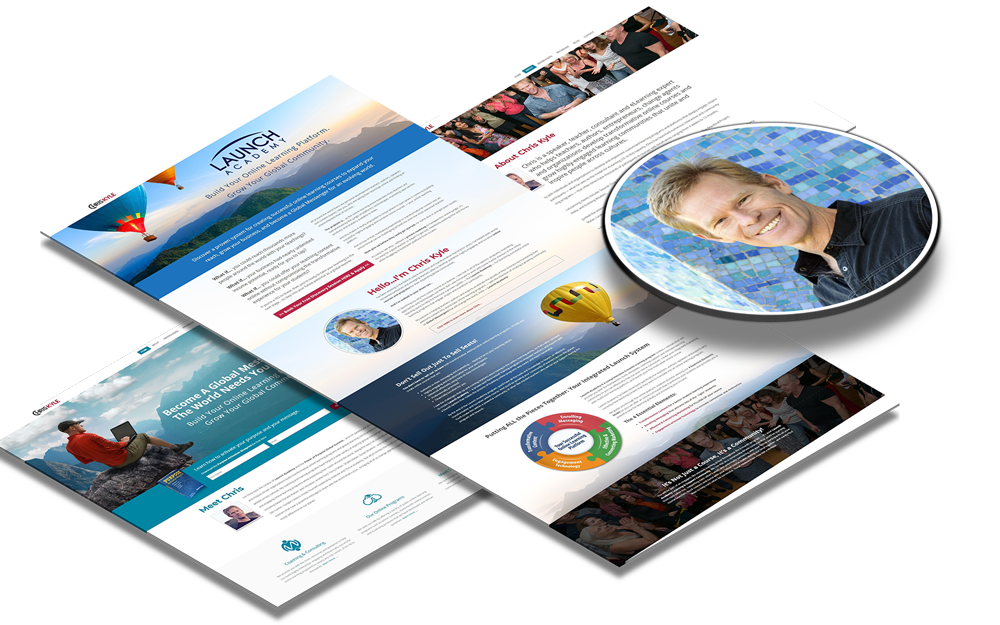
Here Are Our Web Designing Services
The Color Scheme
There are colors for the right mood. The design of your website should consider a pleasing, effective color scheme that complements your images. Unless you are really going for a website with really wild and clashing colors, the following color rules normally apply:
If you want your website to have colors that complement each other use analogous colors. These are the colors adjacent to each other on the color wheel and are often found in nature, hence its natural appeal.
If you want a single color to dominate your website you can choose various shades of that color, but be warned it can come across as a bit boring.
Usability
Is your website easy to use? Are all the things you want to be clicked on easy to access or do users have to scroll down multiple times? Yes, your website should be a reflection of you, but it should also be designed with the user in mind. Make a website user-unfriendly and you can be driving visitors away.
Consistent Theme
Tilted texts are good for the websites that deal with casual topics. Formalor educational websites must have a sense of order and consistency. Your homepage should be more eye-catching than the interior pages, not the other way around, because it’s the first thing people see. Using larger sharp high resolution images and videos are very effective in retaining the interest of the visitors. Once you have a theme maintain it throughout the website, having different themes for different pages can confuse your readers.
The Right Font
There are fonts for the right mood you want to convey. Fonts like Times New Roman and Arial project authority and formality while fonts like Comic Sans MS are for the more playful, quirky websites, be sure you don’t mix them up. Using the wrong font will lessen the impact of a website whether you want it to look no-nonsense or even bordering on eccentric.
There is another pitfall to look out for; just because you can use a lot of fonts doesn’t mean you should. Use a certain font for majority of the text on that page.majority of the text on that page.


